
Mobile and Tablet Screen Sizes: From Centimetres to Pixels
How big phone and tablet screens actually are, in centimetres, inches and pixels. Canvas sizes, margins, tap targets and the mistakes that force a redesign.

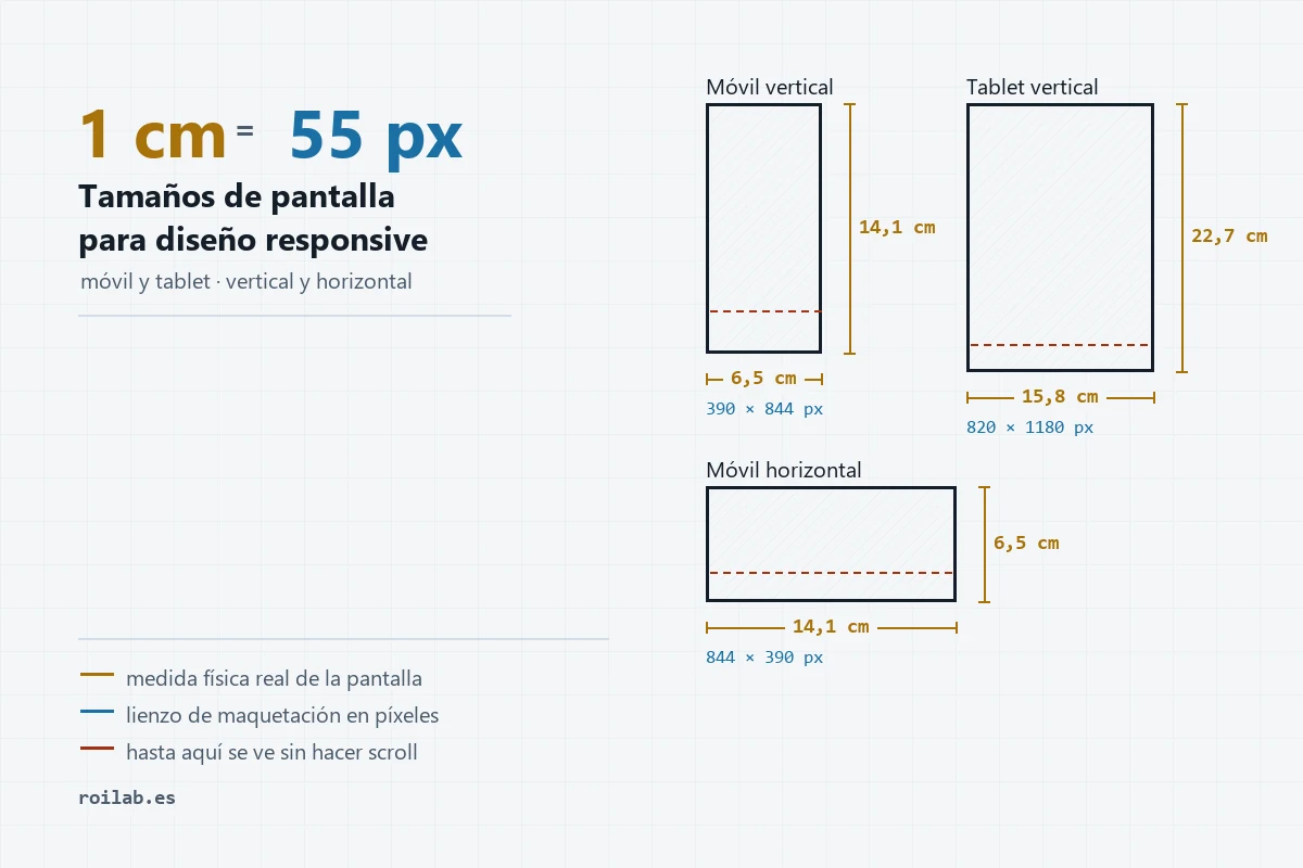
Table of contents
A designer coming from print asks for the measurements in centimetres, and someone on the other side of the table says that is not how the web works. Both have a point, and the whole discussion goes away once somebody puts the conversion on the table.
Centimetres do exist. A screen is a physical object you can measure with a ruler. The catch is that the unit used for layout is a different one, and the translation between them is less direct than it looks.
Why a pixel is not always the same size
The pixel a developer talks about is not a dot of light on the display. It is a reference unit, the CSS pixel, and every device decides how many physical dots it maps onto so that content ends up at a comfortable size.
An iPhone 15 has 1179 physical dots across, but for layout purposes it behaves as if it had 393. The browser multiplies by three. An iPad Pro multiplies by two. That factor is the device pixel ratio, and it is why the same design can look identical on two phones with very different resolutions.
This is also why the conversion to centimetres is not a constant: each manufacturer tunes that scaling differently. In practice the result stays within a narrow band, between 52 and 65 pixels per centimetre across phones and tablets.
As a rule of thumb, 1 cm is roughly 55 px, and 1 inch is roughly 140 px. Neither figure is exact, and neither should be used for anything beyond getting a feel for physical size.
On a desktop monitor the ratio drops to about 38 px per centimetre (96 px per inch, the old print standard). That difference is not arbitrary: a monitor is viewed from 50 or 60 cm away and a phone from 30, so less physical size is needed for the same legibility.
The four canvases you need
You do not need one design per phone model. Four artboard sizes cover almost everything, and the first three are enough for most projects.
| Canvas | Pixels | Physical size |
|---|---|---|
| Phone portrait | 390 × 844 | ≈ 6.5 × 14.1 cm (2.6 × 5.6 in) |
| Phone landscape | 844 × 390 | ≈ 14.1 × 6.5 cm (5.6 × 2.6 in) |
| Tablet portrait | 820 × 1180 | ≈ 15.8 × 22.7 cm (6.2 × 8.9 in) |
| Tablet landscape | 1180 × 820 | ≈ 22.7 × 15.8 cm (8.9 × 6.2 in) |
Phone portrait is the one that matters. Between 70 % and 80 % of traffic to a services website arrives that way, so that is where the design should start rather than where it gets adapted at the end.
A tablet in portrait is roughly the size of a sheet of A4, which helps as a mental anchor. In landscape it behaves almost like a small desktop, to the point that many projects reuse that layout instead of drawing a separate one.
How much is visible before scrolling
This one gets overlooked and it costs. Canvas height is not visible height: browser chrome eats part of it, and on phones it eats plenty.
| Canvas | Total height | Visible height | In cm |
|---|---|---|---|
| Phone portrait | 844 px | ≈ 700 px | 11.7 cm |
| Phone landscape | 390 px | ≈ 290 px | 4.8 cm |
| Tablet portrait | 1180 px | ≈ 1060 px | 20.4 cm |
| Tablet landscape | 820 px | ≈ 700 px | 13.5 cm |
Look at phone landscape. Under 5 cm of height is what you get before anyone has to scroll, and a full-screen hero with an image, a headline and a button does not fit in that. It is why so many sites look empty the moment you rotate the phone.
The fix is not a separate design for an orientation almost nobody uses outside video and maps. Capping hero heights as a percentage instead of a fixed pixel value is enough.
What each element measures in the hand
These are the numbers a designer actually works with. The points column is there for anyone coming from print who wants to compare against something familiar.
| Element | Pixels | Millimetres | Points |
|---|---|---|---|
| Button or icon, absolute minimum | 44 px | 8 mm | — |
| Comfortable button | 48–56 px | 9–10 mm | — |
| Gap between two buttons | 8–12 px | 1.5–2 mm | — |
| Body copy | 16–18 px | 2.9–3.3 mm | 8–9 pt |
| Secondary text, minimum | 14 px | 2.5 mm | 7 pt |
| Headline on mobile | 28–34 px | 5–6 mm | 14–17 pt |
| Side margin on phone | 16–24 px | 3–4.4 mm | — |
| Side margin on tablet | 32–48 px | 6–9 mm | — |
| Space between blocks | 40–64 px | 7–12 mm | — |
The 8 millimetres for a button are not invented: that is roughly what an adult fingertip covers on glass. Apple recommends 44 px and Google 48 px, and below that people miss the target and leave.
The figure that tends to surprise anyone with a print background is the text. A 16-pixel body size works out at about 8 typographic points, which on paper would read as small print. On screen it reads well because the viewing distance is shorter, so there is no need to bump it up on instinct.
What screens actually measure
Active display area for each model, worked out from its diagonal and resolution. The last column explains why the conversion shifts from one to another.
| Model | Physical screen | Canvas | px/cm |
|---|---|---|---|
| iPhone SE | 5.9 × 10.4 cm | 375 × 667 | 64 |
| iPhone 15 / 16 | 6.5 × 14.1 cm | 393 × 852 | 61 |
| iPhone 16 Pro Max | 7.3 × 15.9 cm | 440 × 956 | 60 |
| Galaxy S24 | 6.6 × 14.3 cm | 360 × 780 | 55 |
| Galaxy S24 Ultra | 7.2 × 15.7 cm | 384 × 832 | 53 |
| Pixel 8 | 6.5 × 14.4 cm | 412 × 915 | 64 |
| iPad mini | 11.6 × 17.6 cm | 744 × 1133 | 64 |
| iPad (10th gen) | 15.8 × 22.7 cm | 820 × 1180 | 52 |
| iPad Air / Pro 11″ | 16.0 × 22.9 cm | 834 × 1194 | 52 |
| iPad Pro 12.9″ | 19.7 × 26.2 cm | 1024 × 1366 | 52 |
| Galaxy Tab S9 | 14.8 × 23.7 cm | 800 × 1280 | 54 |
One thing stands out. Between the smallest phone and the iPad Pro there are 14 cm of width difference, yet the pixels-per-centimetre range barely moves. Manufacturers scale their displays so that a 48 px button comes out roughly the same physical size everywhere.
Where the layout changes
The points at which a layout reorganises its blocks are called breakpoints. These are the ones most projects use, and they tell you how many versions need drawing.
| From | To | Device | Typical grid |
|---|---|---|---|
| 320 px | 639 px | Phone | 1 column |
| 640 px | 767 px | Large phone and landscape | 1 or 2 columns |
| 768 px | 1023 px | Tablet portrait | 2 columns |
| 1024 px | 1279 px | Tablet landscape and laptop | 2 or 3 columns |
| 1280 px | — | Desktop | 3 or 4 columns |
A website does not scale the whole design the way a zoomed PDF would. At each of those thresholds it reflows: three columns collapse into one, the menu folds away, images change aspect ratio. A design handed over without notes leaves the developer making those calls alone.
It pays to mark what keeps its size no matter what (logo, icons, buttons) and what grows with the screen (photos, text boxes, content columns).
Five mistakes that force rework
Designing on the phone’s resolution. Look up the specs for an iPhone 15 and you will find 1179 × 2556 pixels. That is the physical resolution and it does not work as a canvas. Laying out there makes everything come out three times too big. The canvas is 390 × 844.
Exporting images at final size only. An icon that occupies 24 px in the design also gets exported at 48 and 72 px, because high-density screens show two or three physical dots per layout pixel. Without those versions it looks soft.
Fixing hero heights in pixels. It works on the phone it was designed for and breaks everywhere else, landscape above all.
Text below 14 px. On the large monitor where the design is drawn it looks fine. In the hand, at 30 cm and with sunlight involved, it does not read.
Forgetting states. A button needs its pressed, disabled and loading versions. If they are not in the design, someone will invent them later, and not always in the right colour.
Setting it up in Figma
Figma ships device presets in the frame panel, so there is no need to type the numbers by hand. Pick iPhone 14 & 15 Pro (393 × 852) or the generic 390 × 844 for phone, and iPad mini 8.3 or 820 × 1180 for tablet.
Work at 1:1 throughout, without multiplying anything, and let export handle densities by setting 2x and 3x outputs. To sanity-check physical size, set the zoom to 100 % and hold a phone up to the monitor: it will not match exactly, since your display has a different density, but it gives you the reference.
One habit that saves arguments: hand over the mobile design first and desktop second. The other way round almost always means taking things out, and taking out hurts more than adding.
Frequently asked questions
How many pixels is 1 cm? About 55 px on phones and tablets, and about 38 px on a desktop monitor. The exact figure depends on the model, since every device scales pixels its own way.
What artboard size should I use for mobile? 390 × 844 px. It is the current standard and matches most phones in circulation.
And for tablet? 820 × 1180 px in portrait, 1180 × 820 px in landscape.
Do I need to design the landscape version for phones? Unless the site involves video, maps or full-screen galleries, it is not worth it. Avoiding fixed heights is enough for portrait to adapt on its own.
Why does my design look smaller on the phone than on the computer? Because a monitor shows fewer pixels per centimetre. A 390 px wide block takes up about 10 cm on desktop and only 6.5 cm in the hand.
What is the minimum size for a button? 44 × 44 px per Apple and 48 × 48 px per Google, which comes to 8 or 9 millimetres a side.
If you are putting a website together and want the design to reach development without surprises, at Roilab we handle both ends of the process. Tell us about the project and we will tell you what it needs.
Share this article
If you found it useful, help others discover it.
SEO · Analytics
SEO and web analytics specialist at RoiLab. Expert in turning data into strategic decisions that improve organic positioning. His analytical approach helps identify growth opportunities that others overlook.
View full profile